CAN WE HELP YOU WITH…
PRINT READY ARTWORK
Read this page. It’s really useful!
CREATING PRINT-READY ARTWORK
There are 3 main things to bear in mind when getting your artwork ready for print…
Does your document contain crop marks?
Did you include bleed?
Is all your important content away from the edges in the safe zone?
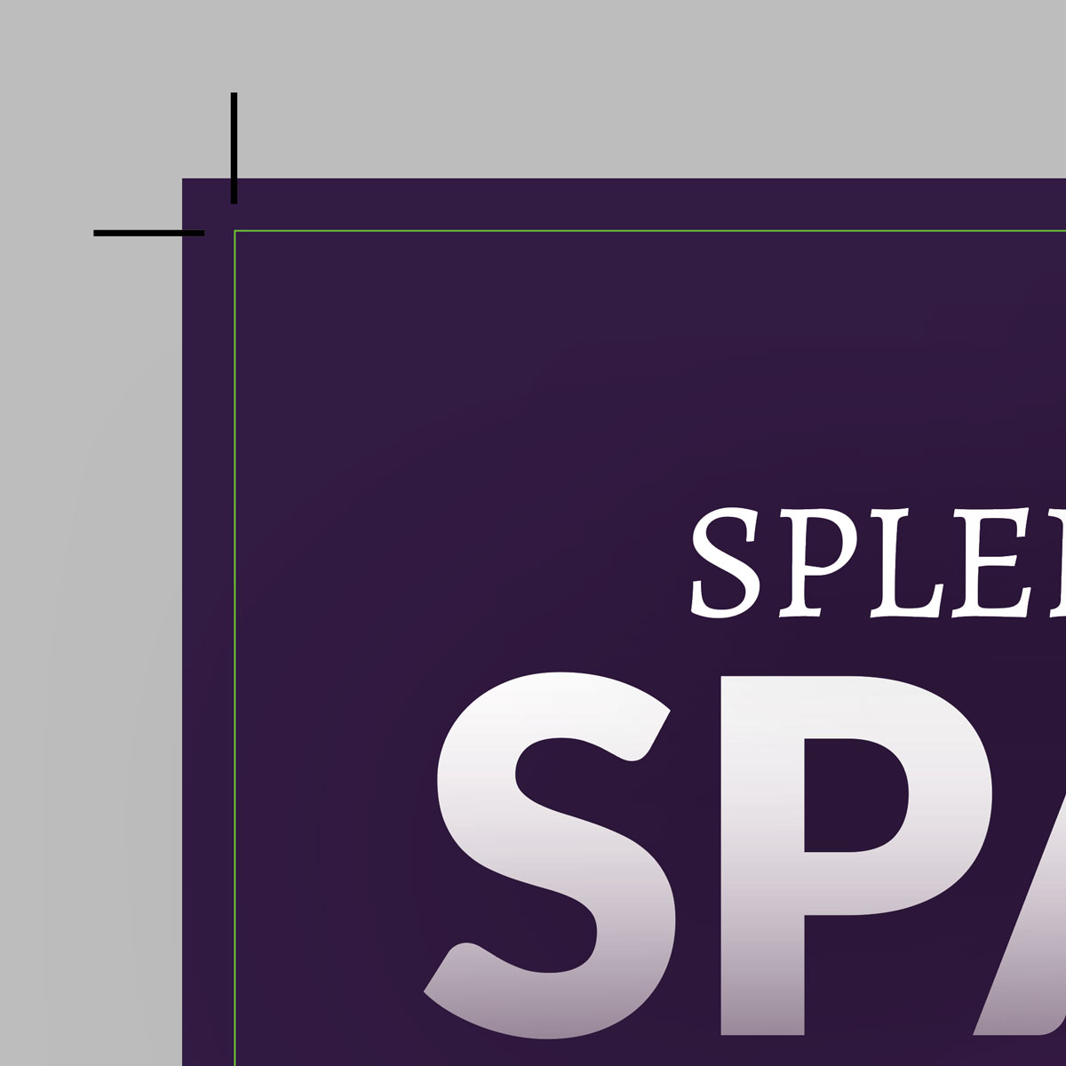
Crop Marks
Crop marks (also known as trim marks) are used to show the required print size of your document. Like many commercial printers, we print on large sheets of paper which are cut down to the required size once printed. Crop marks show where the file is to be cut, for a neat and professional finish.
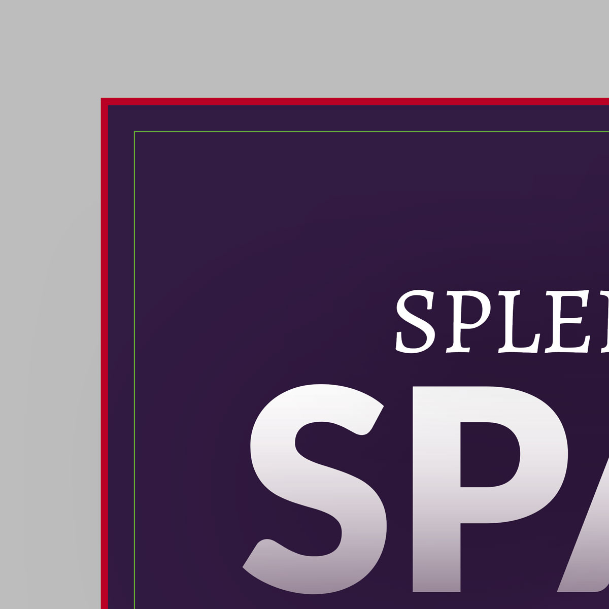
Bleed
‘Bleed’ refers to the area around the outside edge of the artwork. It’s essentially a small area of overprint that gets cut off in the trimming process. Generally, the industry standard is 3mm bleed. This additional 3mm of print extends outside the crop marks on each edge. Bleed ensures the neatest finish when the printing is cut to size.
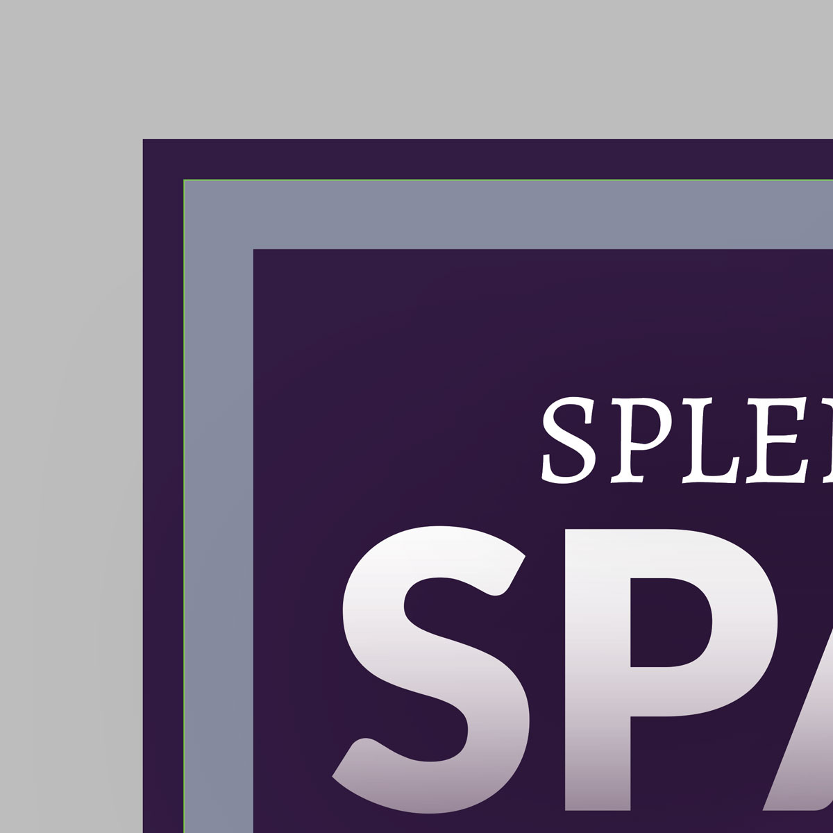
Safe Zone
The safe zone is the main area within the file dimensions for your main content. It’s effectively an inner margin to ensure that important information such as text and logos don’t get too close to the edges. We advise keeping important content at least 5mm all edges in your ‘safe zone’ to prevent important design elements being trimmed.
Setting up your artwork
If your software allows it, add bleed when you first setup your artwork file. Bleed can vary for different products, but it’s generally 3mm.
If your software does not have an option for adding bleed, there is a workaround. Simply add 6mm to the length and 6mm to the width of your print file.
For example:
A4 print ready artwork dimensions = 216mm x 303mm
A5 print ready artwork dimensions = 154mm x 216mm
Keep any important content such as text and logos at least 8mm from your file edges. Extend your background colours and design elements to cover the file dimensions. 3mm of these elements will be cropped from each edge once printed.

If you are unsure about creating your print-ready file, feel free to ask so we can help. We’re happy to give advice before printing your file. We also offer a file-assist service, so if you’d rather leave it to us, please get in touch.

working in canva?
If you’ve created your own artwork online and are now ready to see your design come to life, please remember that we require a print-ready file to ensure the best quality product for you.
Read our guide and find out how to set up and download your print-ready document.
ARTWORK GUIDELINES
When sending us your artwork please provide a single PDF document and use these guidelines:

Bleed & Crop Marks
Supply a PDF set to the correct size, with 3mm bleed and crop marks.

Minimum Font Size - 8pt
Generally, keep text at 8pt or higher so its easy to read.

Minimum Stroke - 0.5pt
Sharp lines should be kept at 0.5pt or thicker.
RESOLUTION
WEB vs PRINT
Screen resolution is measured in PPI (pixels per inch). Print resolution is measured in DPI (dots per inch), Both terms are often used interchangeably.
Most monitors/screens display pixels in a fixed resolution, typically 72 – 100 ppi. Any image optimized for that resolution looks fully detailed and natural to the human eye.
But, if that same image is printed at full size, its pixel blockiness becomes obvious. Images created for online media such as websites have generally been compressed greatly to reduce their file size. This compression can make them look very blurry / pixelated if printed.
SIZE MATTERS
For professional print graphics, 300 dpi is standard. If you want to use a web image for print purposes, you’ll generally run into problems with print quality. The original image just isn’t up to the job and there’s not a lot that the printer can do. You really need access to the original artwork / image (rather than the online version) or you may need to consider re-creating it.
If you have a choice of image sizes at your disposal when selecting it for print (such as from an image library or stock photo website) it’s best to go for the largest image you can get. Reducing an image will not cause quality issues, but enlarging an image may problematic, depending on the image and the scale required. Think “bigger is better”.


Get the most from digital
Artwork Tips
There are a few things to consider when creating artwork for a digital printer. To ensure you get the best print results, here’s some handy tips:
Total ink limits
Avoid using colours with a total ink limit over 275%. Any colours exceeding this will be re-mapped to their nearest equivalent so there may be a noticeable shift.
Design elements
Large areas of flat colour can be problematic, resulting in an uneven solid that can look banded. A large area is defined as larger than 40mm square. Consider adding a pattern or texture.
Using grey
To achieve neutral shades of grey use black only. Best to avoid using grey tints below 20% or over 80%. Large areas of grey look best with a pattern or texture. Greys that are multi channel have a tendency to print unevenly and can have a yellow cast to them.
Gradients and blends
Gradients look best with a slight texture or a low amount of noise to ensure a smoother transition from light to dark. Alternatively, limit blends to less than a 50% tint change. Grey tints are less forgiving than other colours. You’ll get better results if you create your blends in a raster based application such as Photoshop.
Images and scans
Bear in mind that any minor imperfections in images such as specs or scratches may be more obvious due to the difference in technology.
Front-to-back registration
There may be some movement between the front and back of the sheet. This is due to paper stress. A movement of up to 2mm is considered to be within tolerance, hence the importance of bleed.
Need help with your artwork?
If you are unsure that your artwork is set up correctly, we’re happy to take a look and offer advice prior to printing.
Get in touch using the form below or click here to send your files.
GET IN TOUCH
Tell us what you need and let's see if we can help.
Fill in the form or call us on 01332 864990 to have a chat.