
Choosing booklet paper and cover stock for digital toner printing comes down to one practical question: what should the reader feel and see when they pick it up? Weight, finish, and grain direction all change how colour, text, and page-turning behave. With toner, the image is formed by dry powder fused onto the surface, so the stock’s coating and texture influence perceived sharpness, depth, and contrast.
Start with purpose: reading, handling, or display
A training booklet that gets handled all day needs different choices from a one-off product brochure. For heavy reading, prioritise opacity and a calm, matte surface. For display pieces, lean into coated stocks that make photos look cleaner and blacks look denser.
In real production, we often see long paragraphs on a glossy stock look slightly harsher under office lighting, while a good silk or matte makes body text feel more settled without sacrificing image quality.
Pick the inside pages first: uncoated or silk
Uncoated feels natural and is excellent for text-led booklets. Because toner sits and fuses on the surface, uncoated paper can show a softer edge on very fine tints and small reversed-out type. That is not a fault, just a look. If you are running charts or flat colour blocks, choose a smoother uncoated option rather than a heavily textured one.
Silk (satin) is the most forgiving all-rounder. It keeps photographs crisp, holds small type well, and reduces glare. For many programmes, catalogues, and information packs, silk inside pages at 130gsm or 150gsm strike a reliable balance.
Choose a cover that protects without fighting the fold
Cover stock is about stiffness, scuff resistance, and how the spine behaves. A common, dependable choice is 250gsm or 300gsm silk for a stapled booklet. It feels substantial but still folds cleanly.
If you go thicker, the booklet can start to spring open, and the fold can show stress more readily. This is where creasing matters. For example, a 350gsm cover on a 20 page A4 booklet will usually need a proper crease to keep the toner layer looking tidy along the fold and to help the booklet close neatly.
Key trade-offs that affect print quality
- Finish vs readability: silk boosts images, uncoated are kinder to long text.
- Texture vs detail: heavy textures can reduce the apparent sharpness of fine lines and small type.
- Weight vs usability: thicker is not always better if the booklet needs to lie flatter or fold cleanly.
- Opacity vs cost: lighter papers can show more show-through on dense pages.
Colour and file prep: plan for CMYK behaviour
For best consistency, supply artwork as CMYK and avoid relying on bright RGB-only colours that sit outside the printable gamut. If a brand blue looks vivid on screen, it may print slightly calmer in CMYK on a matte stock. Rich blacks also vary by stock; on silk or gloss they appear deeper, while uncoated can look more muted because the surface is less reflective.
A simple recommendation to finish
If you want a safe, professional result for most booklets, choose 150gsm silk for inside pages and 300gsm silk for the cover, with creasing on the cover where needed. Switch to uncoated when the booklet is text-led or needs a natural feel.
Would seeing the options make the choice easier?
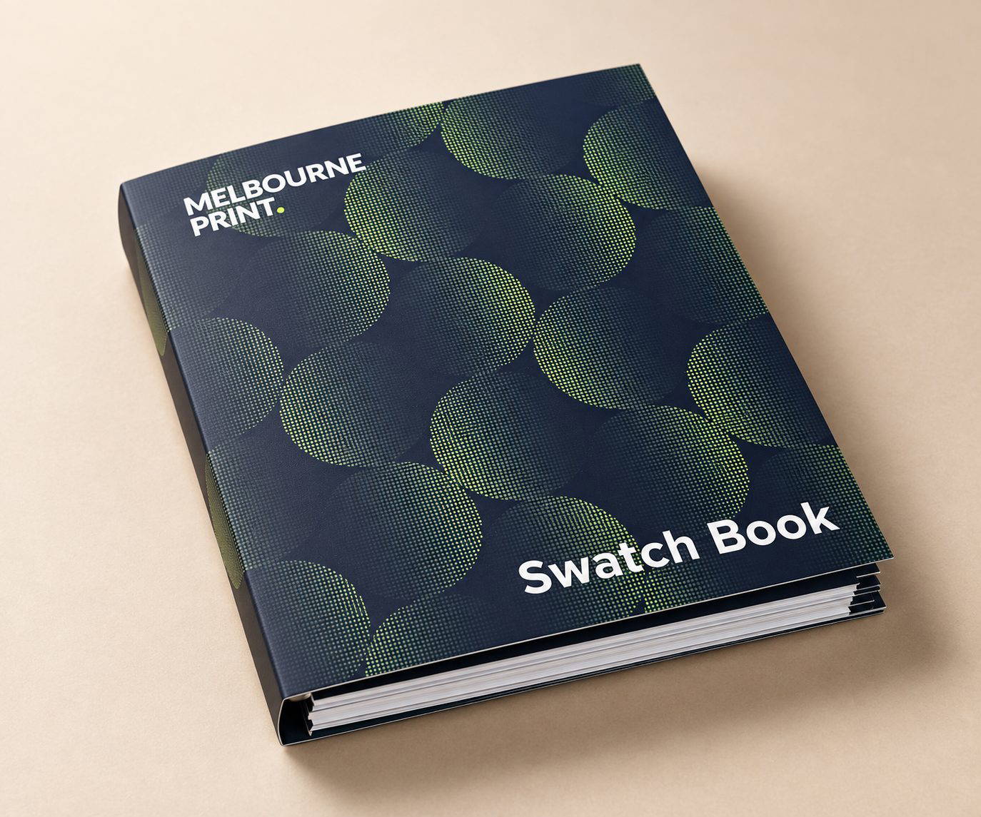
Choosing stocks and finishes is easier when you can hold them in your hands. Compare suitable papers and finishes before deciding what is right for the job. Request a sample pack.