
CMYK vs RGB for Printing: why screens lie
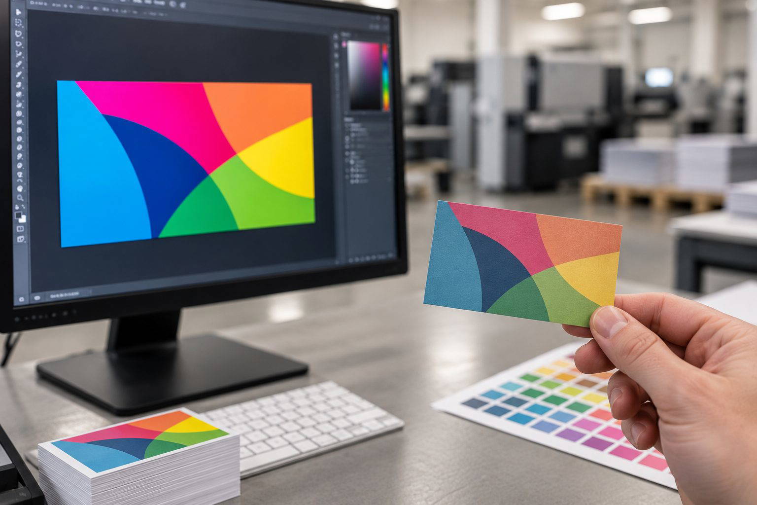
If you design on a screen, you are looking at light. Your monitor mixes Red, Green, and Blue to create colour. That is RGB, and it can show vivid greens, bright blues, and glowing oranges that simply do not exist in ink on paper.
Printing uses CMYK, four inks laid in dots. Cyan, Magenta, Yellow, and Black can produce rich, professional results, but the achievable colour range is smaller than RGB. When an RGB file is sent to print, it must be converted to CMYK somewhere along the line. If you leave that conversion to chance, you risk dull colours and unexpected shifts.
What goes wrong when RGB hits a CMYK press
The most common surprise is loss of punch. A neon style green on a laptop becomes a flatter, more olive tone on a flyer. Deep blues can shift purple. Warm oranges can turn slightly brown on uncoated stock.
In a print shop setting, we often see this when a customer uploads an RGB PNG logo for a business card. On screen it looks electric. Once converted for CMYK printing, the same logo looks muted, especially on matt paper where ink absorbs more.
Set up your artwork for CMYK from the start
Choose the right colour mode and export settings
For brochures, posters, stickers, and anything headed to a press, build the file in CMYK in your design software. If you start in RGB and only convert at export, you may already have chosen colours that are out of gamut for CMYK.
When exporting a print PDF, keep images at 300 dpi at final size and ensure the PDF is set to output in CMYK. If you are supplying a packaged InDesign job, make sure linked images are also CMYK rather than a mix of RGB and CMYK files.
- Create documents in CMYK colour mode for print jobs.
- Use high resolution images (300 dpi at final size).
- Export a print-ready PDF in CMYK rather than sending RGB JPEGs.
- Check blacks and greys so they do not pick up unwanted colour casts.
Paper and finish change colour too
Two prints from the same PDF can look different if the paper changes. A gloss stock holds ink near the surface and tends to look more vibrant. An uncoated or recycled stock can soften contrast and reduce saturation. This catches people out with menus and loyalty cards, where the brand red looks less lively on an uncoated stock than it did on a glossy brochure.
Allow for this by selecting your paper early and proofing with that finish in mind. If you want a bold look on an uncoated sheet, choose slightly less delicate colour builds and avoid relying on very bright RGB-like tones.
Proof before you print a full run
A calibrated monitor helps, but it is still only a guide. If colour accuracy matters, order a small test print of the actual file on the intended stock. This is especially worthwhile for items like retail labels, event posters, and corporate stationery sets where consistency across reprints matters.
Also check any supplied logos. If a client sends you artwork from Microsoft Office or a web download, it is often RGB. Converting and checking it before approving the final PDF saves time, money, and disappointment.
Need help with CMYK vs RGB for Printing: How to Avoid Dull Colours and Unexpected Shifts?
If you are planning a similar print job, contact Melbourne Print for practical advice based on your artwork, quantity, finish, and deadline. You can also email our team or check our print-ready artwork guide before sending your files.