
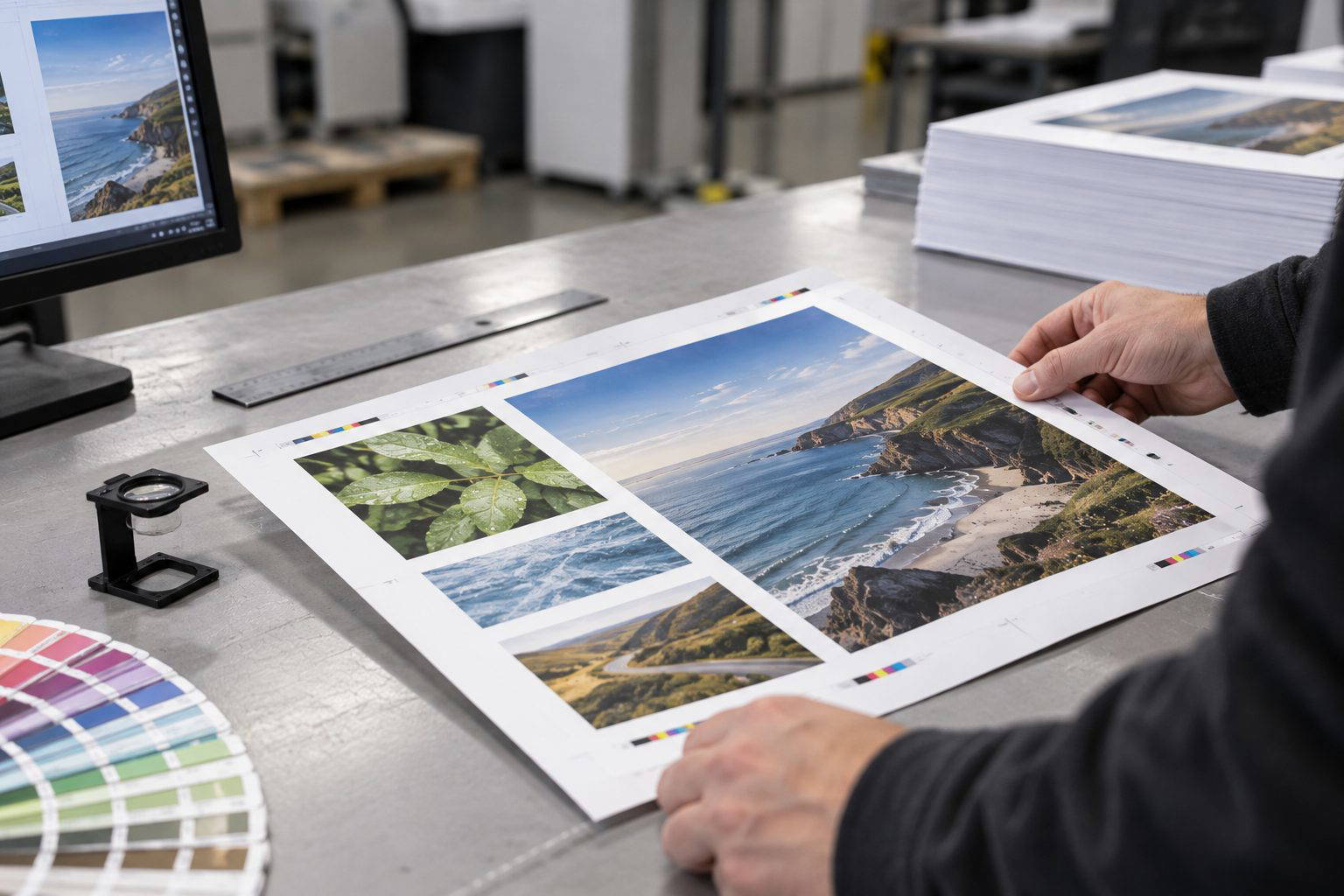
A print-ready PDF is a PDF that will come out of our presses exactly as you expect, with the right size, colour, sharpness, and no nasty surprises at trim. On the shop floor, most “almost ready” files fail for boring reasons: the bleed is missing, the blacks are built oddly, the fonts are still live, or somebody has exported “Smallest File Size” and wondered why their logo looks like it has been rubbed with sandpaper. Get the PDF right and the rest of the job becomes pleasingly uneventful.
Step-by-step checklist for a print-ready PDF
1) Set the correct finished size
Start with the final trim size, not the size you think it “should be”. A4 flyers are 210 x 297 mm. Business cards are often 90 x 55 mm in Australia, but ask first because some brands use 85 x 55 mm. If the PDF page size is wrong, everything else becomes guesswork and trimming gets risky.
2) Add bleed and keep a safe margin
Bleed is the extra image area that runs past the cut line so you do not get white slivers at the edge. For most commercial work, set 3 mm bleed on all sides. Then add a quiet zone inside the trim, usually 3 to 5 mm, more for booklets. Keep fine rules, text, and logos out of that area. Trim is accurate, but it is not magic.
3) Use the right colour mode (CMYK, not RGB)
Print uses CMYK inks. RGB blues and greens can look punchier on screen than ink can reproduce, so convert deliberately rather than letting the PDF export decide. If your job includes a brand colour, tell us if you need a Pantone spot colour or if a CMYK match is acceptable. On packaging sleeves and premium invitations, that choice matters.
4) Check images for real resolution
For flyers, posters, and booklets viewed at arm’s length, aim for 300 dpi at final size. A 72 dpi image stretched to fit an A5 panel will print soft, even on lovely paper. We see this a lot with web graphics and screenshots. If you want a tactile, crisp finish on something like a matte laminated menu, the images need to hold up.
5) Embed fonts or outline them
Missing fonts cause reflow, and reflow ruins layouts quietly. Best practice is to embed fonts in the PDF export. For short pieces like stickers or a one-page promo card, outlining fonts is fine too, but it can make files heavier and harder to edit later. Either way, do not rely on our RIP to “find something similar”. It will, and you will not like it.
6) Flatten transparency and keep effects sensible
Drop shadows, overlays, and transparency can split unpredictably if exported badly. Use a PDF preset intended for press, and avoid low-res flattening. If you are using overprint effects, especially with black text over a coloured background, check a proper output preview before you send.
7) Export with a proper print PDF preset
Choose PDF/X-1a or PDF/X-4 if you can. These standards help lock in colour spaces, fonts, and output intent. Skip “interactive” PDFs. Do not downsample aggressively. If your file is huge because of high-res photos, that is normal for quality print.
Recommendations before you hit send
- View the PDF at 200 to 400% and check edges, hairlines, and small text.
- Turn on crop marks only if you know how to set them properly, and never use them instead of bleed.
- Run a preflight if your design app offers it, and fix warnings rather than ignoring them.
- Send one PDF per item, plus a low-res reference JPEG if the job is complex.
If you want a second set of eyes, send your artwork to Melbourne Print and we will tell you what will print cleanly before it hits the press. Or ask us for paper samples so you can feel the stock and choose with confidence.
Need a hand choosing?
If you would like to handle the stocks side by side, contact Melbourne Print and ask for paper samples. You can also email our team or read our print-ready artwork guide before sending your files.