
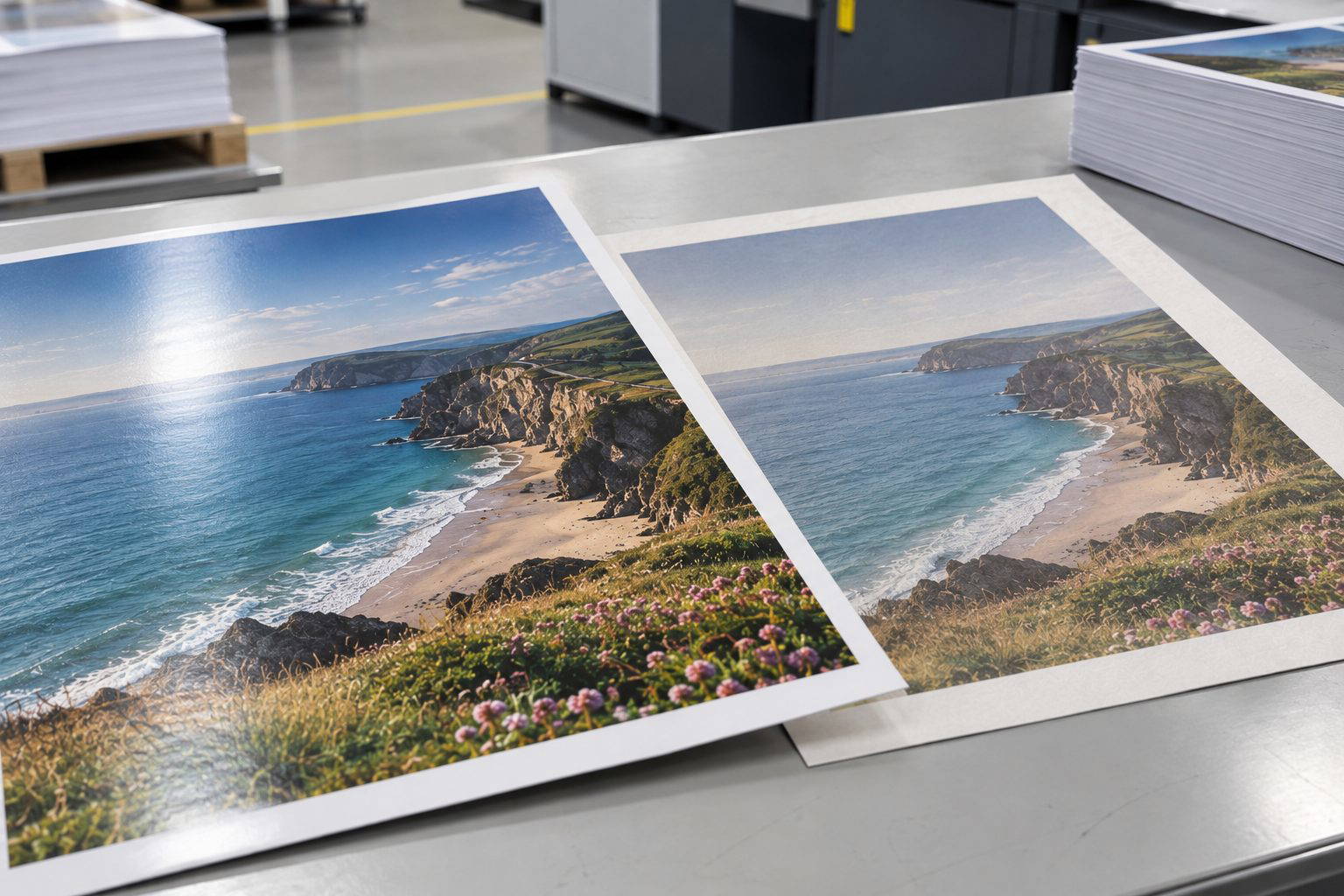
Most first-time print jobs land in one of two camps. If you want colour to look tidy, photographs to feel controlled, and the page to flip smoothly in the hand, silk is usually the safer bet. If you want a more natural, tactile sheet that feels crafted and easy to write on, uncoated tends to win. We see both every week on the print floor, and the right call is less about rules and more about how the piece will be used.
What silk paper really gives you
Silk sits in the middle ground between gloss and matte. It has a soft sheen, not shiny, and that light coating keeps ink dots from soaking in too far. On press, it behaves predictably. Solid colours come out flatter and cleaner, small type holds its edges, and photos keep their contrast without looking overly punchy.
For things like product brochures, service menus, real estate flyers, and corporate booklets, silk tends to look “finished” straight off the guillotine. It also resists finger marks better than uncoated, which matters if your handouts are being passed around at an event or living on a counter for a few days.
Silk and colour accuracy
If your brand colour is fussy, silk is helpful. That light coating reduces dot gain, so blues stay bluer and pale tints don’t drift into a muddy wash. It is not magic, but it gives us more control. A common job example is a café launching a new seasonal menu with food photography. On silk, the images stay crisp and appetising, and the blacks don’t fill in around fine text.
Where silk can frustrate
Ballpoint pens can smear on silk, especially on darker coverage. If you need customers to write on it, think twice. Stickers can also be trickier depending on the adhesive and coating, so if you’re planning labels, ask before you commit.
Why uncoated still earns its keep
Uncoated paper feels honest. It is porous, slightly warmer in tone, and it has that soft drag under the fingers that makes print feel less “corporate”. It also reads well under bright lights because there’s no sheen fighting you. If you want a premium, understated look, a good uncoated stock can do it without shouting.
Uncoated and readability
For longer reading, uncoated is often more comfortable. Think training manuals, community booklets, or a brand story leaflet where the copy matters as much as the images. It also suits letterheads and compliment slips because it takes ink from office printers nicely and it feels right in the hand.
The trade-offs on press
Uncoated drinks ink. Photos lose a touch of sharpness and dark areas can flatten unless we manage the files carefully. If you are printing heavy solids, you may see a slight mottling that you would never notice on silk. None of that is a deal-breaker, but it changes expectations. When a client brings in a minimalist business card design with a big charcoal block, we’ll often steer them to silk or suggest a lighter coverage if they want uncoated.
Recommendations we give customers every day
- Choose silk for brochures, flyers, booklets, photo-heavy menus, and anything needing crisp colour and clean detail.
- Choose uncoated for stationery, note cards, writable forms, editorial-style pieces, and brands chasing a softer, tactile feel.
- If you need people to write on it, lean uncoated, or test the exact pen on the exact stock before printing.
- If colour matching is critical, ask for a printed proof or let us advise on stock and file setup.
If you’re still torn, the fastest way to decide is to feel the sheets and see how your artwork sits on each. Request paper samples from Melbourne Print, or send your PDF through and we’ll recommend a stock that suits the job and the budget.
Need a hand choosing?
If you would like to handle the stocks side by side, contact Melbourne Print and ask for paper samples. You can also email our team or read our print-ready artwork guide before sending your files.